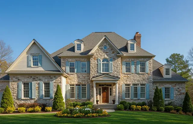
Choosing the right color for your exterior shutters isn’t just about curb appeal—it’s about getting the tone, contrast, and personality of your home just right. The wrong color can throw everything off. The right one can make your house stand out in the best way. Here’s how to make the smart choice.
1. Start With Your Home’s Existing Palette
Before anything else, look at your home’s exterior. What’s the dominant color? Brick red, cool gray, warm beige, deep blue? Your shutter color should work with it, not fight it. You’re not starting from scratch—you’re working with what’s already there.
Pro Tip: If your home has natural materials like stone or brick, consider pulling tones from those elements into your shutter color.
2. Stick to the Style
Shutter colors shouldn’t clash with your home’s architecture. A colonial home calls for classic colors—black, white, deep green, maybe navy. A Mediterranean-style house? Think earthy reds, warm browns, or soft creams. Modern homes? Charcoal, dark grays, or even bold contrasts like black on white can work well.
3. Balance Boldness With Restraint
Want a pop of color? Great—but don’t go overboard. Bright colors like red, turquoise, or yellow can work, but they need to be carefully balanced against your siding, trim, and landscaping. One bold element is plenty. More than that, and things start to get loud.
4. Consider Your Trim
Your trim and shutters should either contrast sharply or be clearly different but in the same tone family. Don’t let them be “almost” the same—it’ll look like a mistake. Black shutters on white trim? Timeless. Navy shutters on off-white trim? Elegant. But navy shutters on medium gray trim? That’s a muddy maybe.
5. Think About Sunlight and Fade
Some colors hold up better than others in direct sunlight. Darker colors tend to fade faster. If your shutters get hit by full sun most of the day, consider fade-resistant finishes or choose a slightly lighter shade than you think you want.
6. Test It Before You Commit
Don’t trust the swatch alone. Paint a sample shutter, or better yet, get a large color board and view it on your house during different times of day. Morning light vs. late afternoon sun can completely change how a color looks.
Final Thought: Go With What Feels Right—But Don’t Wing It
There’s room for personality in shutter color, but it should always feel intentional. Use color to complement your home, not compete with it. Keep contrast clean, stay true to your home’s style, and when in doubt—classic always wins.
Want help making the call? Many shutter companies offer samples, mockups, or even design consultations. It’s worth the extra step.


